From the interdisciplinary scenario offered by the UPV- the only polytechnic university in Spain which includes a Fine Arts Faculty- students from artistic disciplines have been encouraged once again to join our iGEM team this year. We believe in the necessity of the union between arts and science, more specifically between design and science, in order to make our message reach a wider audience in a stronger and more attractive way.
Visual Identity
Naming
The name of a brand/ project is a crucial part since it must give people an idea of what it is about as well as differentiate it from others. Thus, a variety of complex concepts and notions must be represented by one word, which has to be original and recognizable.
Due to the importance of the naming process, we have taken into account the main pillars of this project so that they could be collected under one single concept: Printeria.
Topic
Bacteria printer
Key facts
-
Bacteria SynBio
-
Printer
-
Automatization
-
Scientific divulgation
-
Student project
Key words
-
Bacteria, Cell, DNA
-
Printer, Ink, CMYK, Tonner
Logo
The design of Printeria’s logo is based on a synthesis of our hardware, the central tenant of our project. It is based on digital microfluidics, a technology that allows us to move several droplets over a pads surface. This concept was simplified in the resulting image: two droplets moving on a pad.

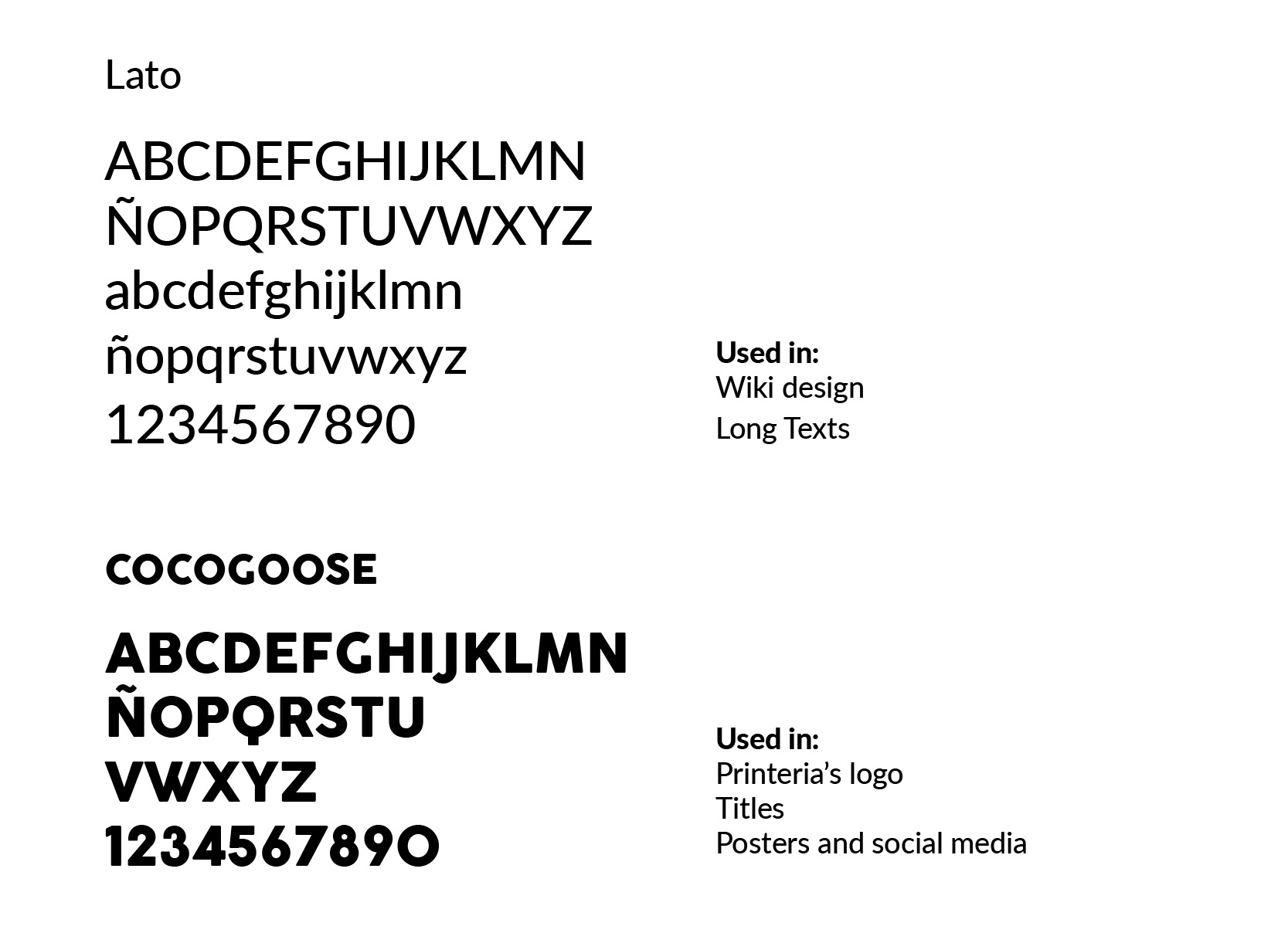
Typography
We have chosen two different fonts in order to combine them through the whole project. To begin with, we have decided that using Lato -a sans serif font- on our text would ease its legibility in both web and printed documents.
The other font that has been chosen is Cocogoose, which is easily recognizable because of its thickness and roundness. These aspects help create harmony between text and illustration.
Color Palette
The color palette is one of the most important design tools to achieve successful communication. It sets the tone for the brand and its content, and it should reflect its values. The emotional use of color is the basis for an attractive design able to connect with the public, which is our main goal.

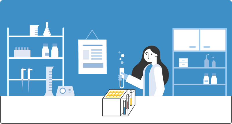
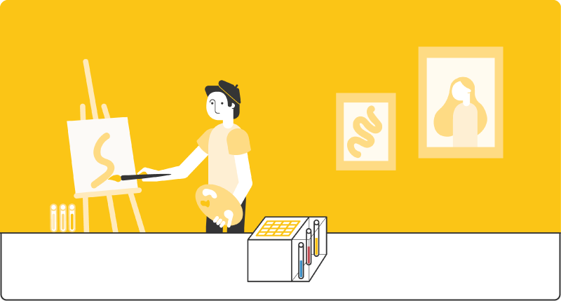
Illustration
As designers, we want to communicate any message as simple and clear as possible, however complex it might be. To achieve it, we have created several digital illustrations and icons to explain and communicate our project as visual as possible.


Social Media
This year we have maintained our interest in social media by being present in some platforms such as Instagram and Twitter in order to advertise the project and let our audience grow in both national and international ways as well as to promote it among UPV students.
Furthermore, a more specific account has been created as part of our human practices. Here, we have been publishing all sorts of activities related to this section of our project, along with its results, providing us a more direct feedback from our public.

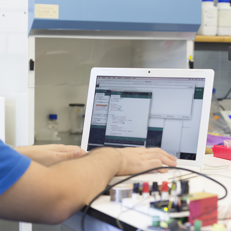
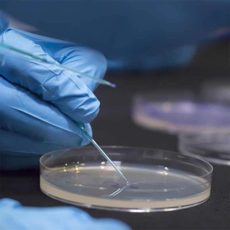
Photography
Constant documentation of the process and its results has been the main focus of photography.